
You can have the best content in your niche and still lose people in the first three seconds. Not because your ideas are weak. Because nothing in the visual presentation gave them a reason to slow down.
Audience retention is a metric most people associate with video. Watch time, drop-off rates, average view duration. But retention starts before the first frame plays. It starts the moment someone sees your profile, your bio, your caption, or your username.
Text aesthetics influence that first moment. And the first moment decides whether there is a second one.
What Text Aesthetics Actually Means?
Text aesthetics refers to the visual quality of written content. This includes the font style, the rhythm of sentences, the spacing of paragraphs, and whether the overall look of your text feels intentional or generic.
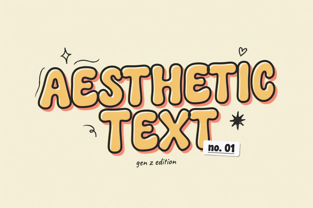
On social media, it often comes down to Unicode typography. A fancy text generator turns plain letters into styled characters that carry visual weight. Cursive, gothic, aesthetic, glitch, calligraphy, and dozens of other styles all change how a piece of text feels before it is even read.
In long-form content like articles and blog posts, text aesthetics means the structure of the page. Short paragraphs. Clear subheadings. Enough white space to let the eye rest. Both versions of text aesthetics work on the same underlying principle: when reading feels easy and visually interesting, people stay longer.
What the Research Says About Visual Text and Attention?
Cognitive load theory offers a useful lens here. When content is visually cluttered or monotonous, the brain works harder to process it. That extra effort costs attention. People do not consciously decide to leave. They just feel tired of reading and stop.
Text aesthetics reduce that cognitive friction. A well-styled piece of text is easier to scan, easier to read, and easier to remember. The brain spends less energy parsing the layout and more energy engaging with the meaning.
Eye-tracking studies on digital reading behavior consistently show that visual hierarchy guides where attention goes. People scan before they read. If the scan reveals visual interest, they commit to reading. If the scan reveals a grey wall of identical text, most people move on.
This is not about making text look pretty for its own sake. It is about making the reading experience feel worth the investment of attention.
How Styled Fonts Hold Attention on Social Profiles?
On Instagram, TikTok, Discord, and similar platforms, your bio and display name are the first text a new visitor processes. They form an impression of your entire account in that moment.
A profile with a plain, unstyled bio reads as default. Not bad, just forgettable. A profile with a styled bio in an aesthetic, cursive, or distinctive Unicode font reads as intentional. That intentionality signals personality, and personality is what makes people want to follow.
The connection to retention is direct. If someone follows because your profile feels distinctive, they are more likely to return to your content. Retention does not only happen within a single piece of content. It happens across an entire account over time. A strong visual identity in your text styling contributes to that longer arc of audience loyalty.
Creators who update their bios with styled text frequently report noticeable increases in profile-to-follow conversion rates. The content itself often did not change. The visual presentation did.
The Role of Caption Styling in Video Retention
On TikTok and Instagram Reels, captions appear below your video while it plays. Most viewers have sound on, but the caption text still registers visually. A styled first line in a caption creates a micro-moment of visual interest that works in parallel with the video content.
More importantly, on feeds and discovery pages where videos autoplay silently, the caption is often the deciding factor in whether someone taps to unmute. A stylized, visually interesting caption line reads as more compelling than a plain descriptive sentence.
This matters for retention because it affects who starts watching in the first place. If styled captions bring in 10% more viewers who decide to start a video, and those viewers watch to completion, the overall retention rate improves. The styled text did not make the video better. It made more of the right people decide to watch it.
Elegant Fonts and the Perception of Value
There is a specific category of text styling that deserves attention on its own. Elegant Fonts carry a perception of quality that influences how audiences evaluate the content they are attached to.
A wellness coach with a calligraphy-style display name reads as more refined than the same coach with a plain username. A fashion creator who uses an elegant serif-style Unicode font in their bio signals taste before a single post is viewed.
This perception of value affects retention because people invest more attention in content they expect to be high quality. Once the expectation is set visually, the content has a higher baseline of engagement to work from.
The same effect appears in written content. A blog post or email with clean, well-spaced typography and thoughtful visual structure feels more worth reading than the same words presented in cluttered, dense formatting. The perception of value goes up, and so does the time spent reading.
Text Rhythm and Reading Flow in Long-Form Content
For creators who publish articles, newsletters, or long captions, text rhythm is one of the most underrated tools for improving retention.
Text rhythm means the variation in sentence length, paragraph size, and visual density across a piece of writing. Short sentences create pace. Longer ones slow the reader down and let an idea breathe. Alternating between them keeps the reading experience from feeling monotonous.
Most people write the way they were taught in school: complete sentences, full paragraphs, consistent structure. That approach works for essays. It works less well for online content, where readers skim first and commit second.
Breaking a long paragraph into two shorter ones takes five seconds. The retention impact, measured in average read time and scroll depth, is consistently positive. Readers stay longer on pages that feel easy to navigate visually, even when the content itself is unchanged.
Platform-Specific Text Aesthetic Strategies
Different platforms call for slightly different approaches, though the underlying principle stays the same.
On Instagram, invest in your bio. It is 150 characters of prime visual real estate. Style it once, style it well, and it works for you every time someone visits your profile. Use a font style that matches your niche, whether that is aesthetic, cursive, gothic, or clean and minimal.
On TikTok, your display name compounds over every impression your content generates. A styled name builds visual brand recognition across millions of views over time. Choose a style early and keep it consistent.
On Discord, styled usernames create social presence inside servers. Members with visually distinctive names get noticed, mentioned, and engaged with more. For community builders, this translates directly into deeper member retention within the server.
For newsletters and blogs, focus on paragraph length and subheading clarity. Each subheading should tell the reader something useful on its own, so a person scanning the page gets value even before they commit to reading the full section.
Why Consistency in Text Style Builds Long-Term Retention?
Single impressions build recognition. Recognition builds loyalty. Loyalty is long-term retention.
When your audience sees the same visual text style across every post, every profile, and every piece of content you put out, it becomes a recognizable signature. Over time, they identify your content by how it looks before they read a single word.
This is how strong personal brands work. The visual language, including the text, is consistent enough that recognition happens automatically. That automatic recognition is what brings people back without needing to be reminded.
Switching styles frequently resets that process. Every new visual approach requires the audience to re-learn who you are. Consistency costs nothing and pays compounding returns.
Small Changes, Real Results
The gap between a profile that holds attention and one that loses it is often smaller than it looks. A styled bio, a consistently formatted caption, a display name that carries visual personality, these are not major creative projects.
They are small, deliberate choices that compound over time. Every viewer who stays one second longer because the profile looked interesting is a data point. Every follower who returns because they remember what your account looks like is audience retention working exactly as it should.