
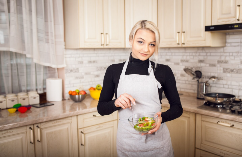
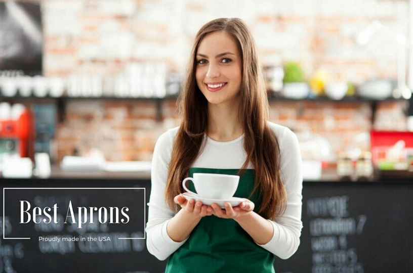
A custom apron is no longer just a protective layer for staff—it has become a visual signature for brands that want to stand out. From boutique cafés and bakeries to salons, craft studios, and retail counters, well-designed aprons now play a direct role in brand recognition and customer perception. When done right, an apron becomes part of the experience, not just the uniform. The difference between a forgettable design and one that gets noticed lies in creativity, detail, and relevance to your brand story.
Why Apron Design Matters More Than Ever
Customers are drawn to visuals before anything else. The first impression often comes from how your staff looks, and an apron is usually the most visible element of their attire. A thoughtfully designed apron communicates professionalism, personality, and brand values in seconds. It also creates consistency across your team, helping your space look organized and intentional.
In competitive markets, subtle branding is not enough. You need design elements that catch the eye without overwhelming it. That balance is what turns a simple apron into a marketing asset.
Bold Color Blocking for Instant Attention
Color blocking is one of the most effective ways to make an apron stand out. Instead of using a single flat color, combine two or three complementary shades. For example, a deep navy base with tan pockets and cream stitching can look both modern and premium.
Color blocking also helps visually define areas like pockets, straps, or panels, making the design more dynamic. This approach works especially well for cafés, food trucks, and creative studios where a vibrant look matches the atmosphere.
Minimalist Logos with Strong Placement
Sometimes, less truly is more. Instead of large, loud logos, consider a small, well-placed logo that feels intentional. Placement matters as much as size. A logo on the chest, just below the neckline, draws natural attention. A logo on the pocket adds a subtle, stylish touch.
Minimalist branding works well for upscale restaurants, boutique stores, and salons where a clean, refined aesthetic is important. It allows the design to feel premium without trying too hard.
Typography That Reflects Your Brand Personality
Fonts carry personality. A handwritten script can feel warm and welcoming, while a bold sans-serif font feels modern and confident. A vintage serif typeface can give a nostalgic or artisanal vibe.
Instead of using standard fonts, consider custom lettering or a stylized version of your brand name. This makes your apron design unique and harder to forget. Typography can be placed vertically along the side, across the chest, or even along the strap for an unexpected detail.
Custom Illustrations for Storytelling
Illustrations are powerful because they tell a story without words. A bakery might use a small illustration of a whisk or rolling pin. A coffee shop could feature a simple line drawing of a coffee cup or coffee plant. A craft store might use scissors, paintbrushes, or yarn icons.
Custom illustrations make your apron feel designed, not generic. They also give customers something to notice and remember, especially when the illustration connects directly to what you do.
Texture and Fabric Choices That Stand Out
Design is not only about what you see, but also about what you feel. Using textured fabrics like denim, canvas, or linen can instantly elevate the look of an apron. These materials photograph well and give a premium impression.
Mixing fabrics is another way to create visual interest. For example, a denim body with leather or faux leather straps adds contrast and style. Textured fabrics also tend to age well, developing character over time rather than looking worn out.
Unique Pocket Designs That Add Character
Pockets are functional, but they are also a design opportunity. Instead of standard rectangular pockets, try angled pockets, rounded edges, or layered pockets. Contrast stitching on pockets can add detail without clutter.
You can also use different fabric for the pockets than the rest of the apron. A patterned pocket on a solid apron, or vice versa, creates a focal point that draws the eye naturally.
Personalized Name Details for a Human Touch
Adding staff names to aprons is a small detail that makes a big impact. It creates a more personal connection between customers and employees. When people can see a name, they are more likely to engage, ask questions, and feel comfortable.
Names can be embroidered, printed, or even added with removable patches. This approach works especially well in cafés, bakeries, salons, and retail spaces where customer interaction is part of the experience.
Seasonal or Limited-Edition Designs
Changing apron designs seasonally keeps your brand feeling fresh. A winter design might use darker, richer tones, while a summer version could be lighter and brighter. Limited-edition designs for holidays, events, or promotions also create excitement.
Customers notice these changes, even if they don’t consciously realize it. It signals that your brand is active, creative, and paying attention to detail.
Eco-Friendly Materials for Modern Appeal
Sustainability is not just a trend—it’s a value many customers care about. Using organic cotton, recycled fabrics, or low-impact dyes can be part of your apron design story. You can even add a small tag or print detail that mentions your eco-friendly choice.
This not only makes your brand look responsible but also gives customers something positive to associate with your business. It’s a subtle message that can influence loyalty.
Straps and Hardware as Design Elements
Most people focus on the front of the apron, but straps and hardware are equally important. Adjustable straps with metal buckles, leather accents, or contrast stitching can make the apron look more crafted and intentional.
Cross-back straps, in particular, are both comfortable and visually interesting. They also help the apron look different from standard neck-loop designs, which customers see everywhere.
Monochrome Designs with a Twist
A single-color apron can still be striking if done right. The key is in the details. Use different shades of the same color, varied textures, or subtle patterns within the fabric. For example, an all-black apron with matte fabric and glossy stitching can look sleek and high-end.
Monochrome designs work well in modern cafés, bars, and high-fashion retail spaces where a clean, editorial look fits the brand.
Cultural and Local Influences
Incorporating local culture or regional elements into your apron design can create a strong emotional connection. This could be through colors, patterns, or symbols that represent your city, heritage, or community.
For example, a café in a coastal town might use nautical colors and rope-style details. A bakery in a historic area might use vintage-inspired patterns. These touches make your apron design feel rooted and authentic.
Contrast Stitching for Subtle Impact
Contrast stitching is a simple way to add detail without overwhelming the design. White stitching on dark fabric, or colored stitching that matches your brand palette, can outline the shape of the apron and highlight seams and pockets.
This technique adds depth and makes the apron look more tailored, even if the overall design is simple.
Patterns That Don’t Overpower
Patterns can be tricky. Too busy, and they distract. Too subtle, and they go unnoticed. The key is balance. Small, repeating patterns or tone-on-tone prints work well because they add interest without stealing focus.
Patterns can be used on the entire apron or just on specific areas like pockets, straps, or side panels. This controlled use keeps the design clean while still giving it personality.
Functional Design That Still Looks Good
A noticeable apron should never sacrifice practicality. Staff need to move, bend, and work comfortably. Designs that consider pocket placement, strap adjustability, and fabric weight will always perform better.
When an apron looks good and feels good, staff wear it confidently—and that confidence shows. Customers pick up on it, even if they don’t realize why.
Matching Aprons with Overall Brand Aesthetic
Your apron should feel like a natural extension of your brand, not an afterthought. Look at your logo, interior design, packaging, and social media style. Use similar colors, fonts, and mood in your apron design.
Consistency builds recognition. When everything aligns visually, your brand becomes easier to remember and easier to trust.
Small Details That Make a Big Difference
It’s often the tiny things that make an apron memorable. A stitched quote inside the hem, a hidden message on the strap, or a custom tag with your brand story can surprise and delight.
These details might not be obvious to every customer, but the ones who notice will remember. And word-of-mouth often starts with small, thoughtful touches.
Final Thoughts on Designing Aprons That Get Noticed
A great apron design doesn’t rely on one single element. It’s the combination of color, fabric, typography, and thoughtful details that create impact. When all these pieces come together, the result is an apron that people notice, remember, and associate with quality.
Whether you run a café, salon, bakery, studio, or retail space, investing in creative apron design is a smart branding move. It enhances your visual identity, improves staff presentation, and strengthens customer perception. With the right approach, even a simple waist apron can become a powerful part of your brand image